MI CANNA CONNECTION

Overview
Welcome to MI Canna, where passion meets precision in the world of marijuana cultivation. As a dedicated marijuana micro business, they take pride in their hands-on approach to production, growing, packaging, and selling all their products on-site.
Established in 2019 by lifelong friends Aric and James (who share a friendship spanning over 15 years), MI Canna was born from a desire to contribute positively to their community in Muskegon.
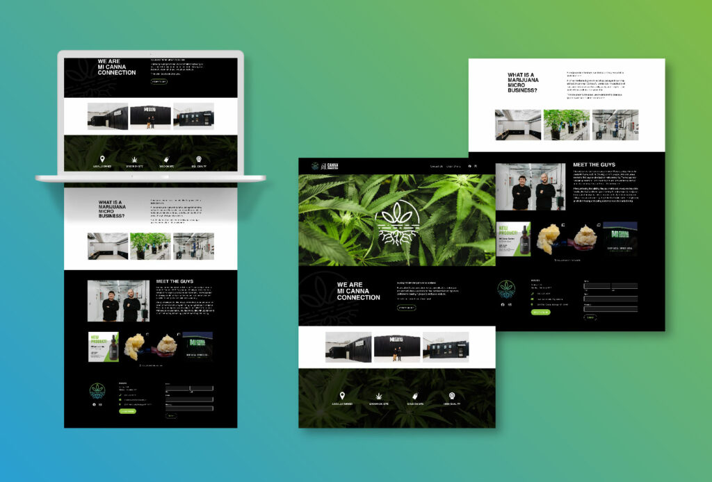
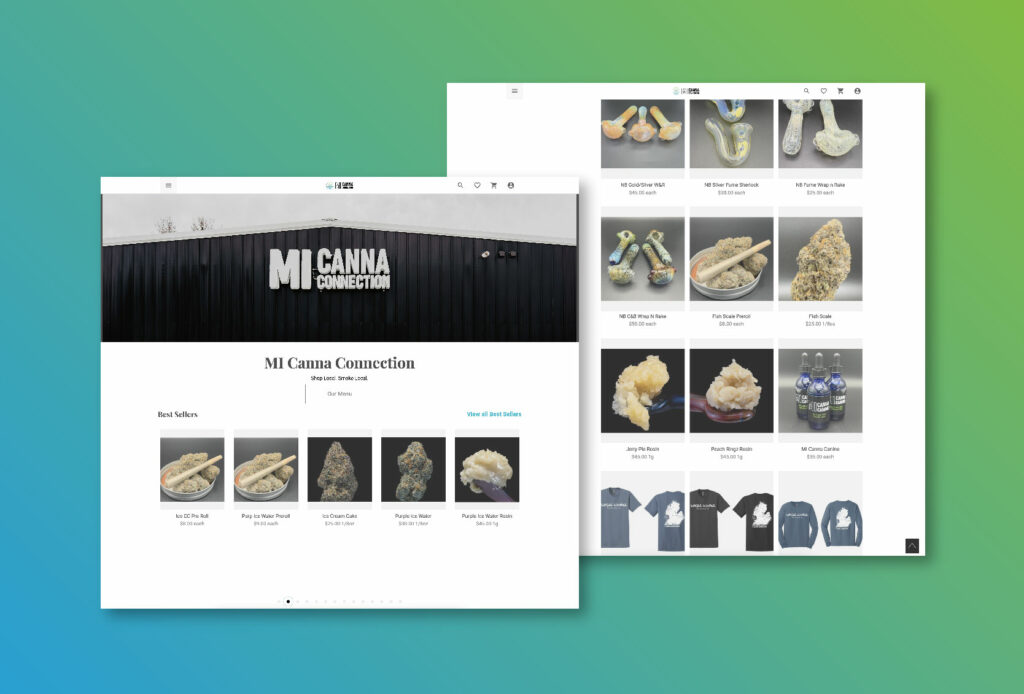
Leverage collaborated with MI Canna on their Naming Strategy and Brand Development. Our team wanted to highlight their business as a homegrown venture. We sought to infuse this local essence in every aspect when designing their logo and website.
DESIGN WORK
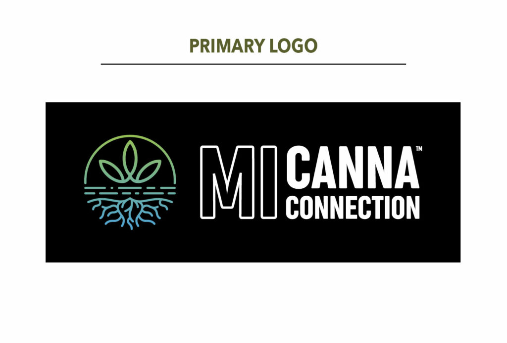
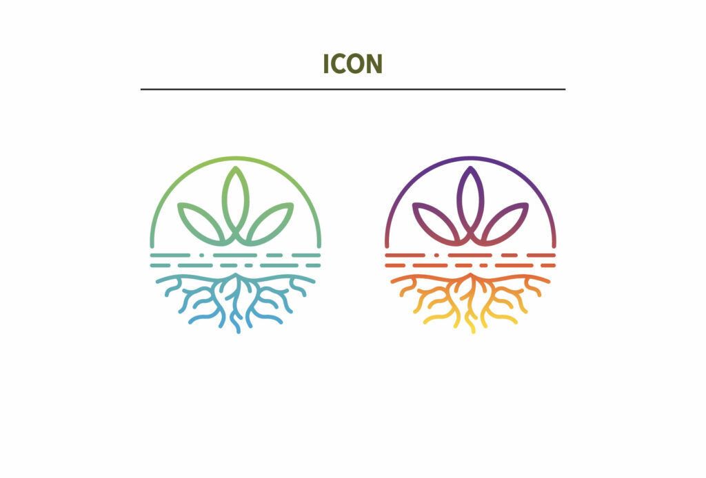
Our Senior Graphic Designer, Miranda, led the design and creative process. Working closely with the MI Canna team, Miranda crafted a brand identity that not only highlights MI Canna’s core mission but also encapsulates the homegrown community aspect. The MI Canna logo is an abstract illustration of the entire plant growth journey, including the sun, water, soil, and roots. The logo features two color variations: the first showcases a gradient from green to blue, symbolizing the connection between the plant and water. The second variation introduces hues of pink and orange, reminiscent of the beloved Michigan sunsets. The collaboration between both teams was so fun to be part of and we are so happy with the brand identity and website build outcome.
Digital Work

